App UX/UI Design
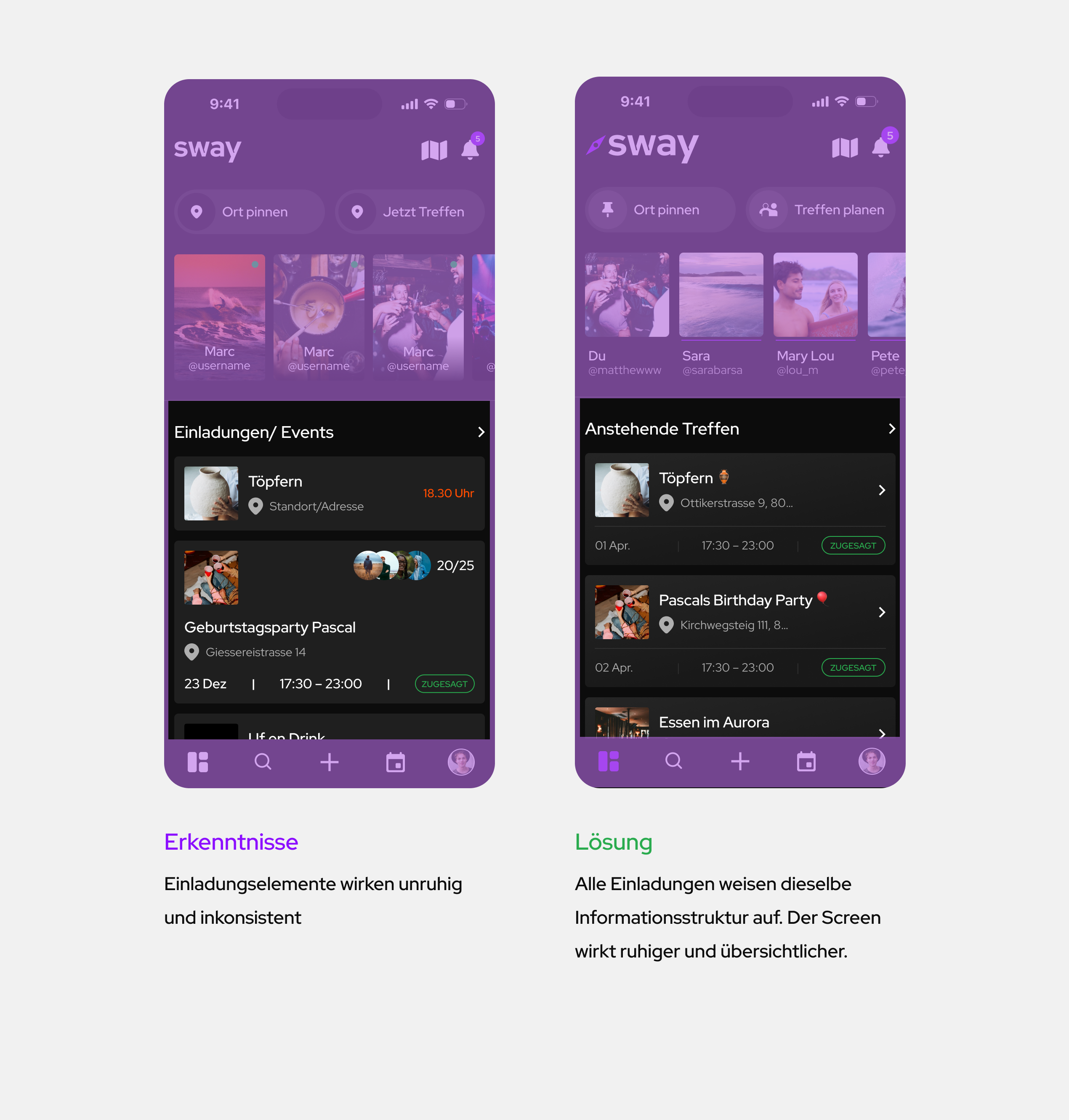
The app Sway aims to solve the problem of ineffective social media communication by providing a streamlined way for users to discover events, plan spontaneous meetups, and explore new locations. It addresses the challenge of reducing clutter in group chats while promoting real-life interactions, allowing users to quickly organize meetups with essential information, enhancing spontaneity and social connections.
Create an app that promotes real-life connections by simplifying the organization of spontaneous meetups, ensuring users can easily discover events and locations nearby.
Inefficient Communication:
Group chats lead to clutter and confusion, making it hard to coordinate meetups.
Lack of Discoverability:
Users struggle to find new events and locations nearby.
Overload of Irrelevant Information:
Existing social apps overwhelm users with non-essential content, making it hard to focus on the essentials.
I conducted a benchmark analysis to compare apps with similar functions. Most social media apps, like Instagram and Snapchat, aim to maximize user screen time by promoting FOMO (Fear of Missing Out) through features like stories. This keeps users constantly engaged. In my analysis, I identified key weaknesses in these apps and aimed to avoid them in my design.
The survey results showed a strong need for such a product. Users described current apps as cumbersome, with an overload of unnecessary information, causing essential details to get lost and increasing organizational effort. They often felt stuck in their familiar social circles, with no clear or accessible information about new events, locations, or spontaneous gatherings. Information about these activities wasn’t centralized or easy to find, highlighting the gap this product could fill.
Using the Value Proposition Canvas, "Sway" is tailored to meet users' specific needs and expectations. The customer profile was created based on insights gained from interviews. The Map Value Proposition outlines solutions aimed at fulfilling these customer needs, ensuring the product directly addresses their pains and enhances their experience.
The users of ‘sway’ are 18 - 34 years old, spontaneous and open to getting to know new places and people.
The Crazy 8 method helped during brainstorming by quickly capturing initial ideas. It became clear that certain key elements had to be included: an interactive map, a search function with a list view, a simple accept/decline option for events, a save feature, and the ability to share favorites.
I sketched a Customer Journey for my two personas, outlining the initial contact, interaction, and use of the app, capturing key moments they experience. Constantly referring to the personas has helped to refine the app’s content, structure, and functionality.
The user story map shows possible user actions. The steps that the user takes to use the product are also shown. The user story map is used to present the user's needs in a rough and clear graphic form.
I created the sitemap to provide an overview of the screens and functions on the respective page. The sitemap also shows the links to the screens and individual functions.
I scribbled my first user flows so that I could gather and record my ideas quickly and without too much effort.
Based on the scribbles and the user flows, I created an initial low-fidelity prototype. I used this to carry out testing at an early stage of development in order to make adjustments without having already done any major preparatory work, and once the adjustments had been implemented and I was sure that the application worked, I started working on the style guide, which I then used to implement the visual design of the app.
The high-fidelity prototype was created using the customised low-fi version and the applied style guide. The testing at high-fi level, taking into account the style guide, resulted in new inputs. Filling in the correct content also revealed further weak points, which were adjusted.
I opted for a simple colour scheme (black, white, gradations) to give the images their full colour effect and to avoid making the design look restless. Sway's brand colours (purple, gold) are used as interaction colours. In addition, green, blue and red are used as status colours and the many shades of grey were used to create hierarchies in the visual design.
Durch die Definition von Variables und Grids erhält das Design die notwendige Konsistenz, um ein durchgängiges Design zu schaffen.
Die Nutzung der Variables in Figma ermöglichte mir eine schnelle und effiziente Umsetzung des dark und light modes.
To make the work easier, I have created components and variants. These make it possible to make changes quickly and easily, even at an advanced stage of the design process.
When choosing the font, I opted for a simple, modern and easy-to-read font (Red Hat Display). For the hierarchical structure of the fonts, I not only used different font styles, but also created clear hierarchies through the gradation of the colour.
Unnecessary group chats are a thing of the past. ‘Sway’ offers you the direct route to your destination! All important information (location, time, duration, details) is available to you. You can confirm or cancel your participation with a simple click without having to go back and forth, and as a participant you have access to the chat function and the list of participants.
In order to offer ‘sway’ users a maximum experience, these features must not be missing.
Add good friends to your network so that you don't lose sight of them.
You can view your stories, videos and pictures, which you share privately or publicly, on your map at any time.
Find friends quickly and easily with just one click.
Share your location with selected friends and groups.
Discover the ‘sway’ app and its functions. The video shows how to navigate through the app using the user flows. These show a possible use of the app by the user.